
READY TO SELL Ecommerce store ONLINE?
Get a store built for you in 5 days, plus training and support to help you start, run, and grow your Alternative business.

Learn why mobile optimization is crucial for your ecommerce store’s success. Increase your sales and reach a wider audience by optimizing your website for mobile devices. Find out common mistakes, best practices, and future trends in mobile optimization.

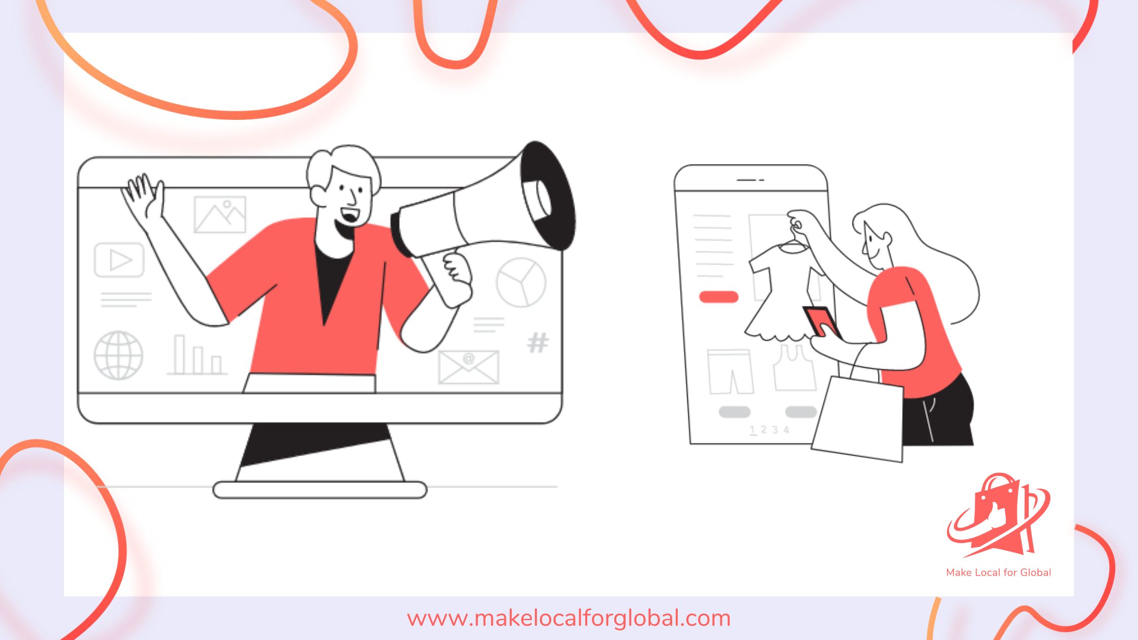
More and more people are using mobile devices to browse the internet and shop online.
Because of this, it’s really important for ecommerce stores to make sure their websites are easy to use on mobile devices. Mobile optimisation is no longer just an option—it’s something you absolutely need in today’s digital world.
In this article, we will explain why mobile optimisation matters so much for ecommerce. We will also give you some tips on how to make sure your online store works well on phones and tablets.
We’ll look at everything from the user experience to technical details, so your store can give customers the best experience possible.
Mobile optimisation is very important for a few big reasons.
First, most people use their phones or tablets to go online. In fact, over half of internet traffic now comes from mobile devices. People are using their phones to shop more than ever.
Mobile shopping is expected to make up over 73% of all online sales soon. This means that if your store doesn’t work well on mobile, you could be missing out on lots of customers.
Second, mobile optimisation is really important for search engines. Google now uses mobile-first indexing. This means it looks at the mobile version of a website first when deciding where it should show up in search results.
If your site isn’t mobile-friendly, it may not rank well. This makes it harder for people to find your store. Google wants to make sure that the sites people see in search results work well on mobile.
Having a mobile-optimised website is key to getting better rankings. Lastly, mobile optimisation is needed to give users a good experience.
If your store isn’t easy to use on a phone, people may have trouble browsing and buying things. This can lead to higher bounce rates (when people leave your site quickly) and lower sales. If your site is hard to use, customers will leave. This can hurt your reputation and your sales.
Google’s mobile-first indexing means that it looks at the mobile version of your site before anything else when figuring out where it should rank in search results.
This change shows that most people are now using mobile devices to access the internet. Because of this, it’s really important for ecommerce stores to make sure their sites are mobile-friendly if they want to rank well in Google searches.
Google offers a tool called the mobile-friendly test. This tool lets you see if your site is working well on mobile. Using this tool and making any needed changes can make a big difference in how well your site ranks.
It also affects how users feel when they visit. The goal is to make sure that your site looks good and is easy to use on small screens.
Your site should be simple to navigate and load quickly so that users don’t get frustrated. This will make it more likely that they will buy something.
There are lots of good reasons to make sure your ecommerce store is mobile-optimised:
If users can find what they need quickly and the site works well, they’ll probably stay longer and make a purchase.
Satisfied customers often become repeat buyers. They may even recommend your store to their friends.
Responsive design means that your website looks good and works well on any device, no matter the screen size.
Ecommerce stores should use a “mobile-first” approach when designing their sites. This means they focus on making sure the site works well on phones and then adjust for bigger screens.
By doing this, you make sure all the main features and content are made with mobile users in mind. Responsive design helps make sure that users have a great experience no matter what device they use.
Your site should automatically adjust its layout based on the device’s screen size. This way, users don’t have to zoom in or scroll too much to see things properly.
How fast your site loads is a big deal for the user experience.
If your site takes too long to load, people are more likely to leave. This means fewer conversions (sales).
It’s important for ecommerce stores to make sure their sites load quickly on mobile. You can do this by compressing images, using a simple theme, minimising scripts, and using browser caching.
Another great way to make your pages load faster is to use accelerated mobile pages (AMP). AMP technology helps create pages that load almost instantly. This can be really useful for ecommerce stores that want to improve the mobile experience.
Remember, every second counts. If your site is too slow, customers will move on to another store.
User experience is everything for ecommerce stores.
On mobile devices, users need to be able to easily navigate your site, find products, and make purchases without any problems. Make sure your site has clear and simple menus, forms that are easy to fill out, and a checkout process that isn’t confusing.
A clean design with easy navigation will help customers have a good experience when visiting your store on their phones. Buttons should be big enough to tap without any trouble. Text should be easy to read without needing to zoom in.
All important information should be easy to find. It’s also important to make sure users can easily search for products.
A clear search bar and simple product categories will help people find what they want more quickly.
Mobile optimisation is not just about design—it’s also about content. Your text should be easy to read on small screens. Images and videos should load quickly.
Keep your content short and to the point so it’s easy for people to understand. Use bullet points to break up information and make it easier to scan.
Product descriptions should be brief and informative. Customers need to be able to get the information they need without scrolling through a lot of text.
Good-quality images and videos that load fast can help show off your products better. Most people prefer looking at pictures or videos over reading long descriptions, especially when they’re on their phones.
Optimising your site for mobile search is also very important. Your meta descriptions and title tags should be clear and to the point. These are the first things people see in search results.
You should also think about optimising for voice search, since more people are using their phones to ask questions out loud when looking for products.
Adding conversational keywords and phrases to your content can help people find your products when using voice search. Questions like “Where can I find cool running shoes?” or “How do I clean a leather bag?” can be added to your content to attract more people using voice search.
The checkout process on mobile should be as easy as possible. Your ecommerce store should have a simple, mobile-friendly payment form.
This means having big buttons, easy forms with only the important fields, and lots of payment options. You can also offer popular mobile payment choices like Apple Pay, Google Pay, and PayPal, which make it more convenient for customers.
A smooth payment process helps lower the chances that customers will abandon their carts before buying. Let customers save their details for future checkouts too. Making it convenient can encourage them to come back and buy more.
You might be wondering if you need a mobile app or if optimising your website is enough. Mobile apps can give a better experience, but they can be expensive to create and maintain.
Apps also allow you to add special features like notifications, wish lists, and special deals that keep customers interested. On the other hand, making sure your website works well on mobile devices is usually cheaper and can reach more people.
The choice really depends on your goals and budget. If you think an app could help you keep customers engaged and boost sales, it might be worth the investment. For smaller stores, focusing on a great mobile website is often the best place to start.
There are some common mistakes that stores make when trying to optimise for mobile:
Avoiding these mistakes will help your store offer a better experience for mobile users. This will lead to higher conversion rates.
There are lots of tools that can help you make sure your website is ready for mobile users:
Using responsive design frameworks like Bootstrap can also make sure your website is easy to use on different devices. You could also consider using Accelerated Mobile Pages (AMP) to improve page speed, especially for people using mobile devices.
It’s important to see how well your mobile optimisation efforts are working. Use analytics tools to check things like traffic, bounce rate, and how many people are buying from your site using their phones.
These insights can help you figure out what’s working and what needs to be changed to improve the experience and boost sales. Pay special attention to how many people are abandoning their carts.
Look at how long people are staying on your pages and if there are certain points where people are leaving. If you notice users dropping off in specific areas, it’s important to make changes to fix that.
Keep testing and making improvements to get the best results.
Mobile optimisation will keep being really important for ecommerce stores in the future. More people are using their phones to shop, so making sure your site works well on mobile is key to staying competitive.
As technology changes, stores should look into using new things like augmented reality (AR) and voice search to make the user experience even better. AR can help customers see what a product might look like in their home or when worn.
This can be very helpful for things like furniture and clothing. Voice search is also getting more popular, so making sure your content uses natural language can help customers find you more easily.
Mobile optimisation is a must for ecommerce stores. It improves the user experience, helps your store show up higher in search results, and builds trust with your customers.
To stay ahead, your store needs to be mobile-friendly, have a responsive design, load quickly, and make checking out easy. It’s also important to keep checking how well your mobile optimisation is working and keep making improvements.
By doing this, you can make sure your store is always user-friendly, up-to-date, and successful in a world where mobile shopping is only getting more popular.
Why is mobile optimisation important for ecommerce stores?
Mobile optimisation is important because more people are using mobile devices to shop online. Google also uses mobile-first indexing, so websites that aren’t mobile-friendly may not rank well in search results.
What are some common mistakes in mobile optimisation?
Common mistakes include slow loading times, not optimising for mobile search, difficult forms, and not using a responsive design.
Should ecommerce stores have a mobile app or just optimise their website for mobile devices?
It depends on your goals and budget. Mobile apps can give a better experience, but they cost more to make. For smaller stores, focusing on having a great mobile website is often the best place to start.
How can ecommerce stores measure the success of their mobile optimisation?
You can use tools like Google Analytics to track mobile traffic, bounce rates, and conversions. This data will help you see what’s working well and where improvements are needed.
What is the future of mobile optimisation?
Mobile optimisation will keep being important as more people shop using their phones. Stores will need to keep improving for new technologies like augmented reality and voice search to make the shopping experience even better.
PREFERRED SOURCE
Like what you’re reading? Add Make Local for Global as a preferred source on Google to see more of our articles when you search.
Build your online presence without having to figure out everything yourself.