

A visitor lands on your store after seeing a post, email or search result. They should be able to tell what the Valentine’s offer is, which products are included and whether delivery suits their plans. You do not need to decorate every corner. A clear headline, a focused gift collection and accurate product details will […]


A visitor lands on your store after seeing a post, email or search result. They should be able to tell what the Valentine’s offer is, which products are included and whether delivery suits their plans.
You do not need to decorate every corner. A clear headline, a focused gift collection and accurate product details will help people decide what to do next.
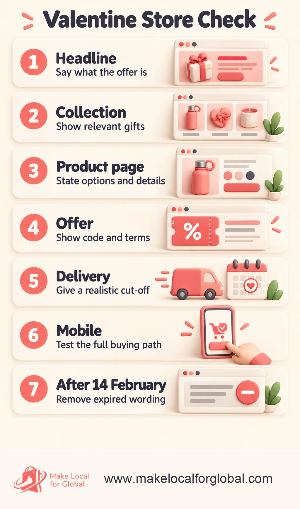
Write the message before you change the design. A useful announcement says what is available and gives the customer a direct next step. For example: “Valentine’s gifts under £25” can link to that collection. If the offer is “10% off selected gifts with code LOVE10”, say which gifts qualify and when the code ends.
A homepage hero could read “A little gift for someone you care about” with a button such as “Shop Valentine’s gifts”. Use a product photo that matches the words. A generic heart graphic over a mug or candle can make the page feel seasonal, but it does not tell shoppers what they will find.

Help visitors browse by a decision they already need to make. Depending on your stock, categories might include gifts for friends, gifts for partners, self-care, personalised gifts or gifts under £20. You do not need every category. A category with one unsuitable item adds another click without helping anyone choose.
For a small maker selling candles, notebooks and cards, a “For a friend” group could contain a candle and card. A “Small gifts under £20” group might show the notebook, a mini candle and a card set. The same product can appear in more than one relevant collection, but give each page a clear reason to exist.
For a shop with a narrow range, one well-named Valentine’s collection may be enough. If you sell flowers, for example, splitting a dozen bouquets across “for him”, “for her”, “for friends” and “for couples” may create empty or repetitive pages. A single “Valentine’s flowers” collection with clear size and price options can be easier to use.
Avoid assuming who will buy a product or who will receive it. “A thank-you gift” gives the visitor room to decide. Recipient labels can help people browse, but they should describe a useful selection rather than tell someone what they are expected to buy.
| Store situation | Useful page change | Check before publishing |
|---|---|---|
| A few suitable products | One seasonal collection with short descriptions | Each item suits the theme and is in stock |
| Many products at different prices | Recipient and price filters or a few focused collections | Categories lead to distinct, useful choices |
| Made-to-order gifts | Show personalisation options and production time | The date estimate matches current workload |
| Products with no seasonal link | Keep them in regular browsing, not the Valentine feature | Seasonal wording has not been forced onto them |
Choose the page structure that reflects your actual range and inventory.
A collection page gets attention; the product page answers practical questions. Read it as someone buying a gift who may not know your materials, sizing or personalisation options.
For example, “personalised silver keyring” is not enough if the buyer cannot see the character limit, font choices, metal finish or whether a gift box is included. Add those details before directing more campaign traffic to the page.
Start with the item and its main choice, then explain what arrives in the parcel, how to personalise it, how long preparation takes and what delivery option is available. Do not make a customer open several separate pages to learn whether a gift box or message card is included.
A handmade card page, for example, can state the card size, paper finish, envelope colour, whether the inside is blank, the character limit for a printed message and the time needed to dispatch. A gift set can list every item in the box and show one photo of the full contents beside a closer view of each product.
Review variants as well as the main description. If the red ribbon shown in the photo is only included with one option, name that option. If a visitor has to guess whether the selected size, colour or bundle appears in the basket, improve the choice labels before promoting the page.

Use images that help someone judge the item. Show scale with a familiar object or a person holding it, include the packaging if it is part of the purchase, and photograph a personalised example without suggesting that every order will look identical.
A small jewellery shop might show a necklace on a person, then in its gift box, with a close-up that shows the clasp. A food seller might show the box closed, the treats inside and the label with ingredients. The right set depends on the questions people need answered before they can choose.
Keep seasonal decoration around the product rather than over it. If a heart-shaped frame hides the size or finish of a bracelet, use a simpler background. Give every image useful alternative text that describes the product and relevant detail, not a string of search terms.
MLFG lists store design, setup and training in its current plans. Review the details and check whether they fit the work your business needs.
Put the code and its conditions beside the offer, not only in a social caption. State what products qualify, any minimum spend, whether the code works with other offers and the final date and time. Test the code in a real basket before launch, including an item that should qualify and one that should not.
If a product price is promoted, customers need a clear view of the amount payable and relevant charges. The CMA’s price transparency guidance covers price information in online marketing and on retail websites. Rules can depend on the offer and business facts, so get qualified advice for a specific legal question.
Run a real test order path before launch. Choose one item from the collection, add it to the basket, apply the code, change a product option, then remove the code and confirm the displayed total updates. Check that the button from the homepage lands on the same products named in the offer. A coupon can work perfectly, yet the page link may still point to last season’s collection.
For a “free delivery over £35” offer, test a basket below the threshold and another above it. Check whether the threshold counts before or after the coupon, then write the terms in words customers can follow. This is a practical checkout test, not a claim that one offer structure suits every store.
Do not hide the dispatch and delivery details at the bottom of a long page. State how long you usually need to prepare the order, which service you expect to use and the last date you can responsibly recommend for Valentine’s arrival.
For a made-to-order gift, tell shoppers the making time before they add it to the basket. If the cut-off has passed, replace “arrives for Valentine’s Day” with accurate wording. A late order can still be a gift for later, but a countdown cannot make delivery certain.
Check the full route from paid order to handover: stock picking, any personalisation, quality check, gift wrapping, packing, collection time and carrier transit. If you have a backlog of twelve customised mugs and can finish only four per day, the page should not promise dispatch tomorrow to every new buyer.
If you offer local collection, state the location, collection window and how the customer will know the order is ready. If the service is not available for all products or dates, list the limits next to the choice. Do not leave visitors to discover them in a confirmation email.
Open the store on a phone, not just in the desktop editor. Check whether the headline wraps well, the offer remains readable, buttons are easy to tap and product photos show the important detail. Try the route from homepage to product page to basket.
A common snag is a banner that looks tidy on a wide screen but takes up most of a mobile display. If the visitor has to scroll past a large graphic to reach the gift collection, shorten it or use a smaller image. Keep a visible route back to normal shopping too.
Try these steps on a phone: load the homepage on mobile data, open the Valentine’s collection, tap a product, select each available option, add it to the basket and look for delivery information. Check whether the text overlaps an image, whether the offer code can be copied and whether the checkout button remains visible without covering important details.
Then ask someone who did not build the page to find one particular gift. Give them a natural request, such as “Find a personalised card under £10.” Watch where they pause. If they cannot tell which products are personalised or where the price filter is, adjust the labels and navigation. This small test can catch unclear wording before more people reach the page.
Do not assume the visual editor shows every phone size. Check at least one narrow screen and one larger phone if available. Pay attention to small code text, long product names, pop-ups that block the page, and buttons placed too close together.
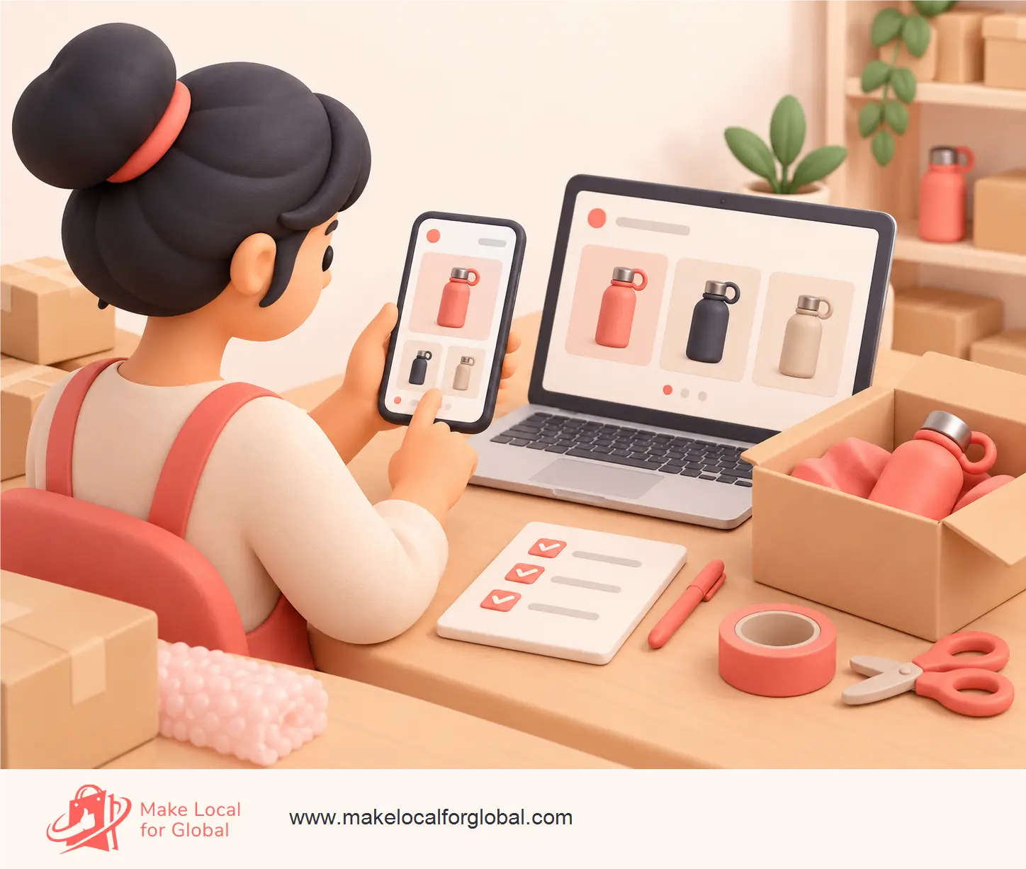
Write down the page, products, wording, offer and dates before you contact MLFG. The team can tell you what support is available for your plan.
Set a reminder now to remove or revise the seasonal message after the campaign. Check the hero, announcement strip, code, gift collection, product badges and any ad or email links that still show the old end date. Keep useful products for everyday sale, but remove wording that no longer applies.
Make the clean-up list before the campaign goes live. Write down the exact pages and tools you changed, such as homepage banner, announcement bar, coupon, featured product row, collection, scheduled social posts and paid advert. Add the date and time the offer ends beside each one.
For instance, if the code expires at 23:59 on 14 February, schedule a morning check on 15 February rather than assuming the banner or email will remove itself. Test any saved link that customers may still have. Keep the products listed if they remain suitable, but return them to plain descriptions like “personalised notebook” instead of “last chance Valentine’s gift”.
Take a small independent shop with candles, cards and ceramic mugs. Its owner chooses a modest “gifts under £25” collection, with a separate page for personalised cards. The homepage banner links to the first collection; the card page states the message limit, production time and dispatch details.
Before publishing the seasonal page, the owner checks that three candle scents are in stock, confirms which mug colours can still be packed, and tests the offer code against an excluded item. On a phone, they find that the banner wraps to four lines and pushes the products out of view, so they shorten it to “Small Valentine’s gifts under £25”.
Two days before the stated delivery cut-off, the owner reviews current orders and the carrier’s service information. They keep the delivery message only for orders they can still prepare in time, remove it from later orders, and schedule a 15 February check for the banner and code. The example uses no sales forecast; it shows how to match the page to stock and fulfilment facts.
Use a short line that identifies the gift collection or offer, then link to the page where visitors can act. Include the relevant terms if you mention a discount.
Create one if you have enough suitable products to make it useful. A focused collection of a few good options can help more than a large group of unrelated items.
Review the homepage, announcement strip, expired code, product badges and active campaigns. Remove date-specific claims, then keep products available under wording that suits them year-round.
List the change you need, where it belongs and when it should end. Visit MLFG to review ecommerce support options or send a focused enquiry.
PREFERRED SOURCE
Like what you’re reading? Add Make Local for Global as a preferred source on Google to see more of our articles when you search.









Build your online presence without having to figure out everything yourself.